Custom Search

Thursday, September 26, 2013

BlackBerry 9720 review

blackberry-9720-front.jpg
Earlier this year, BlackBerry unveiled the BlackBerry Z10, Q10 and Q5 smartphones that run on BlackBerry 10 OS, the company's brand new mobile operating system. However, BlackBerry did mention that it will continue to sell phones that were based on its legacy OS, BlackBerry 7 OS. 

It's worth pointing out that the Canadian device maker was able to increase its market share in emerging markets like India, South East Asia and Africa by selling cheaper devices running its legacy OS at a time when it was being ditched by customers in mature markets like the US and Europe with the rise of Android and iOS. It priced the BlackBerry 10 devises much higher, positioning them in the premium segment, so new devices based on older versions of its OS were perhaps part of its strategy to take care of the budget and mid-range segments. 

The BlackBerry 9720 is the first among these devices. Unlike previous BlackBerry OS 6/ 7/ 7.1 devices, the 9720 doesn't identify its target segment with a prefix such as Bold or Curve. That's probably because we're unlikely to see any high-end (Bold) devices running legacy operating systems. Instead we're likely to see only economy phones in the segment.

We received the review unit of the BlackBerry 9720, and have put it through its paces since. Will the 9720 be the much needed saviour to pull the younger crowd back to the brand as BlackBerry goes into crisis mode? Is it the best low cost device for people who need a phone with a hardware keyboard? We try to find out in our review.

Design/ Build
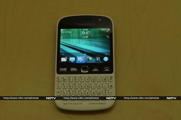
The BlackBerry 9720 looks pretty similar to the new BlackBerry Q5 except for the hardware buttons that sit immediately below the screen. The phone is available in Black and White variants, and we got the latter colour option as our review unit.

The BlackBerry 9720 features a touchscreen as well as a hardware (QWERTY) keyboard. Just like the Q5 the phone is a bit less curved and features a hard plastic keyboard.
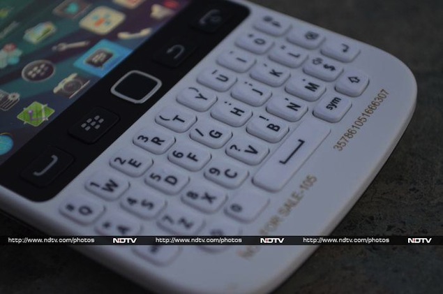
blackberry-9720-keyboard.jpgThe front of the BlackBerry 9720 features a 2.8-inch touchscreen, 35-key keyboard, notification LED and a visible sensor, sitting above the display. The phone provides the auto-brightness feature as well, so it could be the ambient light sensor that's visible, though with the touchscreen, a proximity sensor would also be fitting. The four usual hardware keys for accepting calls, accessing the menu, going back, and rejecting calls are placed below the display along with the optical trackpad.

Interestingly, the BlackBerry 9720's display panel and the hardware keys are all Black in colour contrasting the phone's White colour.

Just like the BlackBerry Q5, the keyboard on the 9720 is arranged in a more linear fashion (than the previous curved keyboards seen on the Curve series) and the keys are well-spaced out. The keys offer good tactile feedback and are large enough for convenient and quick typing. The keys provide solid tactile response, with a 'click' feel and sound, offering a great typing experience. This is a major plus point, as the hardware keyboard is one of the biggest USPs of this device.

The BlackBerry 9720 features a black-coloured rubberised frame in the middle that also houses some hardware keys and ports. It also helps to make the device easy to grip.

The right-side of the 9720 houses the volume rocker keys with a mute key sitting between, and a camera shortcut key that can also be programmed to perform other functions.
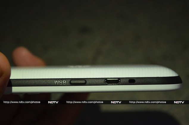
blackberry-9720-back.jpgThe Micro-USB port and a shortcut key that launches BBM (BlackBerry Messenger) by default are located on the left-side of the 9720. The 3.5mm headset jack and the Screen lock key sit on the top.

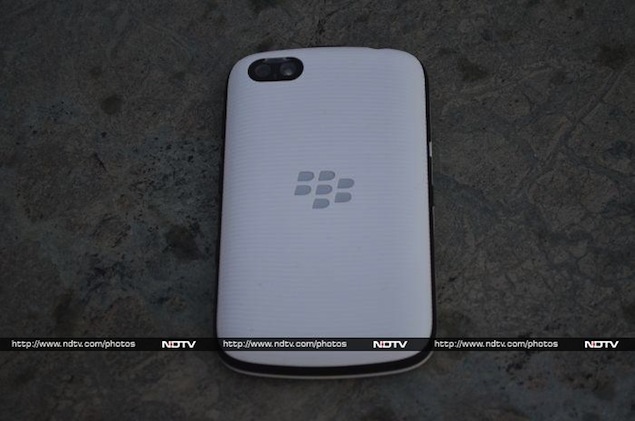
The BlackBerry 9720's back features a removable plastic cover that sports a rubberised texture and a design featuring ribbed lines. The silver-coloured BlackBerry logo is embedded in the middle. The back sports a 5-megapixel camera and an LED flash. 

We were not happy with the 9720's back cover, as it did not fit securely on the phone, and felt like it will fall off any moment. We're not sure if this issue was just limited to our unit, and the flaw becomes our single biggest gripe with the build quality of BlackBerry's latest entry-level handset.

Display
The BlackBerry 9720 sports a 2.8-inch IPS LCD display with a resolution of 360x480 pixels, boasting of a pixel density of 214ppi, and providing some decent viewing angles.
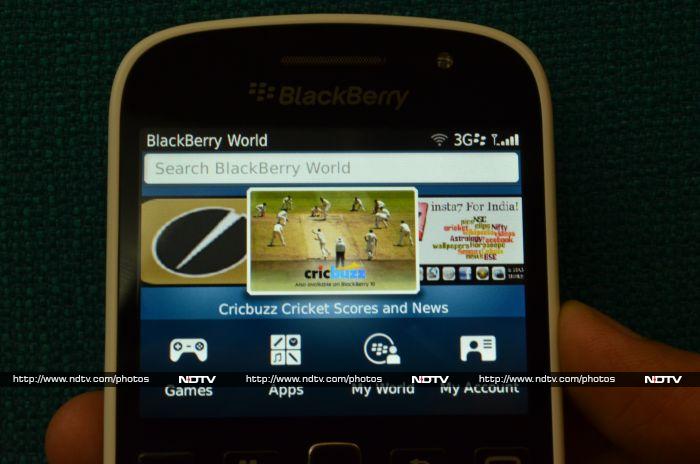
blackberry-9720-screen.jpgThe 9720's display offers good sunlight legibility and text, images and videos appear sharp and clear. However, with its small display, the 9720 is clearly not targeted at people who primarily use their phones for watching multimedia content. 

The touchscreen of the BlackBerry 9720 offers a responsive and smooth touch experience, which we did not experience any problems with.

Camera
The BlackBerry 9720 sports a 5-megapixel rear camera that comes with an LED flash. 

The BlackBerry 9720 camera app offers different scene modes including auto, face detection, portrait, sports, landscape, party, close-up, snow, beach, night and text.
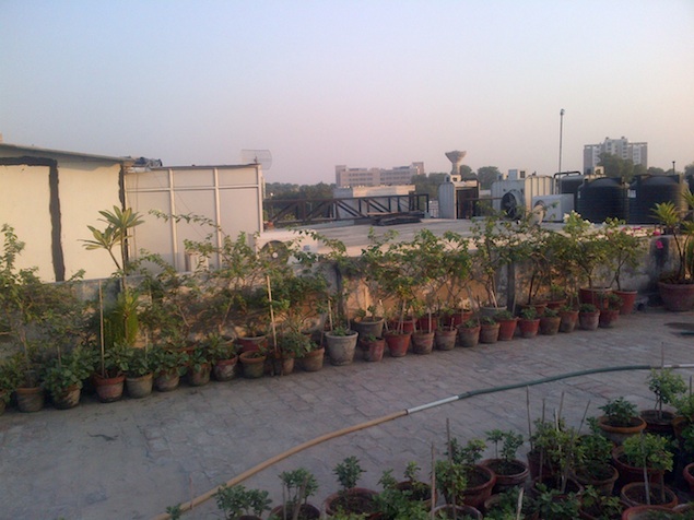
blackberry-9720-camsample1.jpgThe 9720's camera is fixed focus, which makes close-up and macro shots seem flat. We'd have preferred an autofocus camera instead, offering more options. It's good enough for taking a quick picture and sharing it with your friends via email and social networks. 

Pictures taken with the BlackBerry 9720 outdoors in daylight were decent, but the ones taken indoors and in low light conditions were grainy and lacked detail.

The video mode allows you to shoot VGA resolution videos. Videos shot through the phone were of average quality. There's no front camera on the 9720.
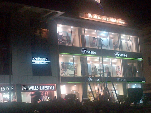
blackberry-9720-camsample2.jpgWe expected a device in this price range to sport a better camera, and the BlackBerry 9720 disappoints in this regard.

Software/ User Interface
The BlackBerry 9720 runs BlackBerry's legacy OS, BlackBerry 7 OS (version 7.1). If you've used a BlackBerry Curve or Bold device before, than you'd be at home with the 9720's software.

The interface offers a homescreen, a status bar that also offers quick toggles for settings when tapped (or clicked), a notification pane and an app drawer that arranges app icons in various panels. 

The build of BB 7.1 OS that comes with the BlackBerry 9720 also features a different BlackBerry 10-style lock screen that has a camera shortcut icon. You can swipe up to unlock the screen.

Universal search is integrated with the OS, so when you type the name of a contact, app or any other keyword when you're at the home screen, the BlackBerry 9720 offers relevant results.

The OS comes with social networking apps like Twitter and Facebook, and Documents to Go and Foursquare. The popular BlackBerry Messenger, which is a major USP of BlackBerry devices, is also present.

It's worth pointing out that you'll need to activate a BlackBerry service plan to access email and BBM on the BlackBerry 9720. Even Facebook and Twitter access require the service to be activated, though some additional tweaks can get them to work with certain data plans.
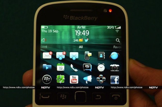
blackberry-9720-menu.jpgThere's also a new app on the 9720 called Multicast, which allows you to post a status update on multiple social networks in addition to the usual Social Feeds app that brings updates from all configured social networks including Twitter, Facebook and BBM.

The BlackBerry 7.1 OS also comes with Wi-Fi Hotspot functionality for sharing the phone's Wi-Fi connection with other devices.

We tested BlackBerry Bridge with a BlackBerry PlayBook tablet and found that it works well. You can connect your PlayBook to the Internet via the phone or control it through the Bridge app's touchpad, and manage and reply to emails, messages and BBM messages, and manage calendar entries through the PlayBook.

Overall, BlackBerry 7.1 OS looks and feels primitive compared to modern smartphone operating systems like Android, iOS and Windows Phone (or for that matter, even BlackBerry 10 OS). The Canadian smartphone manufacturer would do well to abandon the legacy platform altogether, following the current Android example of recent iterations available even for entry-level devices. 

Though BB 7.1 OS supports multitasking, apps offer limited functionality and except for chat and social networking, it doesn't offer any unique or value-adding capabilities. Notably, the native web browser doesn't come with Adobe Flash.

Performance
The BlackBerry 9720 is powered by an 806MHz Tavor MG1 processor and has 512MB of RAM, apart from 512MB of built-in storage that's expandable up to 32GB via microSD card. While BB 7.1 OS doesn't need high-end hardware to run smoothly and third party apps are not that demanding, we feel that BlackBerry could have added more memory for smoother multitasking. 

The overall experience of navigating through the BlackBerry 9720's interface was satisfactory and we didn't see the spinning clock or hourglass in our use. However, opening multiple tabs on the web browser slowed down things and you'll still see a lot of checker-boarding while browsing graphics-heavy websites. Also, installing certain apps requires the phone to restart, leaving you disconnected for about a minute.
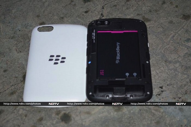
blackberry-9720-back-cover.jpgThe BlackBerry 9720 is responsive otherwise, and we did not experience any lag while opening apps, navigating the menu, and even playing games like BrickBreaker. 

We were not able to play HD (720p and 1080p) clips on the BlackBerry 9720, with formats like MOV and MKV not being supported natively, though some formats like AVI and low-resolution MP4 did play fine, in standard definition. 

The speaker outlet on the BlackBerry 9720 delivers good quality sound at high volume levels, thanks to the placement of the speaker outlet.

Call quality was very good and the phone is able to latch on to cellular networks even in weak signal areas.  

The BlackBerry 9720 also includes FM radio functionality, which users in India would appreciate. The phone doesn't include NFC functionality however, not too surprising at this price range.

The BlackBerry 9720 comes with a 1,450mAh battery, and in our usage, it lasted us a full workday. We charged the phone in the morning, and with medium to heavy usage, including 1-1.5 hours of phone calls, synching two email accounts, playing some music, gaming, taking some photographs, receiving Twitter notifications, and using BBM and WhatsApp chat, the phone lasted a good 10-11 hours.

It's worth pointing out that we had turned off Wi-Fi and auto-brightness, and the phone was hooked to a 3G network with the screen brightness at the highest level. Altering these settings might help in running the phone for a longer duration, depending on your usage pattern.

Verdict
The BlackBerry 9720 is a decent hardware QWERTY keypad smartphone, but unlike its BlackBerry 10 siblings, it does not deliver when it comes to multimedia consumption, and offers a primitive operating system compared to Android, BB10, iOS and Windows Phone based smartphones.  

BlackBerry has obviously tried to reduce the price point of touch-enabled hardware QWERTY phone with the 9720, prior to which, touch functionality was restricted to the Bold and Torch series smartphones. 

The 9720 sports a better screen than the Curve 9320, but it enters the market much after. At a price of Rs. 16,000, the 9720 is overpriced if you look at its hardware specifications and feature set. We also don't like the 9720's flimsy back cover.
blackberry-9720-bbmkey.jpgIt becomes a difficult to recommend this phone to anyone who is not looking for a QWERTY keyboard and doesn't make heavy use of messaging features majorly, simply because of what's being offered by other handset makers at this price point. 

However, if you're a messaging junkie (though BBM is on its way to Android and iOS), like the comfort of a hardware keyboard coupled with a touchscreen, and don't want to spend too much, this phone's a pretty good option for you, excluding a few outdated Android devices.

If you don't need a touchscreen, the Curve 9320 is a good alternative and is priced around Rs. 2,000 less. If you don't need 3G, then the Curve 9220 is the cheapest BB 7.1 OS-based phone available, at about just Rs. 9,000.

BlackBerry 9720 in pictures
 

Price:
 Rs. 15,990

Pros
•    Good physical keyboard
•    Decent battery backup

Cons
•    Runs the outdated BB 7.1 OS
•    Less memory (RAM) affects performance occasionally 
•    Overpriced

Ratings (Out of 5)
- Design: 3
- Display: 3
- Performance: 3
- Software: 2.5
- Battery Life: 3.5
- Value for Money: 3
- Camera: 2.5
- Overall: 2.5

Nokia Lumia 1020 with 41-megapixel camera launched in India, available October 11

Nokia-Lumia-1020.jpg
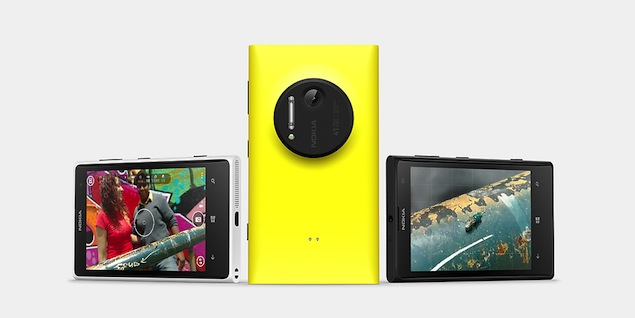
Nokia has launched its new flagship smartphone, the Nokia Lumia 1020, in India. The Lumia 1020 will be available with retailers across the country starting October 11, and Nokia will only be revealing the cameraphone's price a day before that, on October 10.

The new Lumia 1020 comes in three colour variants: Black, White and Yellow. Two accessories of the Lumia 1020 have also been announced for India, for which Nokia has revealed the prices. The Nokia Camera Grip will be available for Rs. 7,500, while the Wireless Charging Shell will be available for Rs. 3,200.

The Finnish handset maker had unveiled the phone at an event in New York, in July. The Nokia Lumia 1020 comes equipped with a 4.5-inch display which is almost the same size as the one on the Lumia 920 and Lumia 925. 

The Lumia 1020's display boasts of a pixel density of 332 PPI. The Nokia Lumia 1020 is powered by a 1.5GHz dual-core Snapdragon processor with 2GB of RAM and runs Windows Phone 8. 

The USP of the phone is its 41-megapixel PureView camera sensor which offers Optical Image Stabilization (OIS), backside-illuminated image sensor, 6 lens optics along with a Xenon Flash. Nokia has also added some camera software including the Nokia Pro Camera app and Smart Camera Mode. It also offers a 1.2-megapixel front facing camera. The phone comes with 32GB internal storage which is non-expandable. 

Commenting on the launch, P. Balaji, Managing Director, Nokia India said, "The response to the Nokia Lumia range in India has been extremely encouraging."

So far, Nokia's high-end range of Lumia smartphones have not been a major hit in the Indian market, and though the more affordable models have been doing well, the company is still struggling to get back its share in the smartphone segment.

The Lumia 1020 is not the first PureView phone from Nokia. The company had launched the 808 PureView phone last year, that featured a 41-megapixel snapper and created a lot of buzz. Next in the list was Lumia 920 with PureView technology that focused on low-light imaging.


Mobiles launched in September 2013


Nokia Lumia 1020 key specifications
  • 4.5-inch AMOLED ClearBlack display with 768x1280 resolution
  • 1.5GHz dual-core Qualcomm Snapdragon S4 processor
  • 2GB RAM
  • 32GB of internal storage
  • 41-megapixel PureView rear camera
  • 1.2-megapixel wide-angle front camera
  • Windows Phone 8
  • 2,000 mAh battery

Sony Xperia M Dual with Android 4.1 up for pre-order for Rs. 14,490

sony-xperia-m-dual.jpg
When it announced the Xperia M and Xperia M dual smartphones, Sony had promised a Q3 rollout for the entry-level devices. It looks like the company is living up to its word and the phones have finally made it to the Indian market.

The dual-SIM version of Sony's entry level smartphone, Xperia M, which was announced in June along with its single-SIM counterpart, is now available for pre-order through online retailer Flipkart for Rs. 14,490. It's worth mentioning that Sony has not officially announced the availability of the phone in India.

The website mentions the estimated release date of the Xperia M Dual as the first week of October. The phone is available in Black, White and Purple colour variants.

The Sony Xperia M Dual is powered by 1GHz dual-core Snapdragon S4 Plus MSM8227 processor with 1GB of RAM. It features 4-inch TFT LCD with a resolution of 480x854 pixels and boasts a scratch-resistant display. It runs Android 4.1 Jelly Bean with Sony's Timescape UI on top. The phone offers dual-SIM (GSM+GSM) support.

The phone offers 4GB of internal storage that can be expanded up to 32GB with the help of microSD card. The Xperia M Dual sports  a5-megapixel rear camera with LED flash and a VGA front camera. Connectivity options include Wi-Fi, 3G, Bluetooth 4.0, aGPS and NFC. It also includes a 1,750mAh battery that can deliver 10 hours of talk time and 498 hours of standby time on 2G networks, according to Sony. 

The single-SIM version of the phone, the Sony Xperia M was also listed on ecommerce websites in August, for Rs. 12,990. The phone features the same hardware specifications and the only difference is that it offers support for just one SIM card.


Mobiles launched in September 2013
 

Sony Xperia M Dual key specifications

  • 4-inch TFT LCD with a resolution of 480x854 pixels
  • 1GHz dual-core Snapdragon S4 Plus MSM8227 processor
  • 1GB RAM
  • 4GB internal storage, expandable up to 32GB via microSD
  • 5-megapixel rear camera with LED flash
  • VGA front-facing camera
  • Dual-SIM (GSM+GSM)
  • Wi-Fi, 3G, Bluetooth, aGPS, NFC
  • 1,750mAh
  • Android 4.1 Jelly Bean

Samsung Galaxy Trend 3 budget Android 4.2 smartphone unveiled

samsung-galaxy-trend-3-front-big.jpg
Samsung has introduced a new budget dual-SIM Android smartphone, the Galaxy Trend 3. The device has been launched in China, though the company has not revealed the pricing and availability details of the device. For now, there is also no word on the roll out of the device to other markets.
The Galaxy Trend 3 follows similar design language as company's flagship smartphone, the Galaxy S4. However, it features more basic hardware specifications. The Android 4.2 Jelly Bean-based Galaxy Trend 3 bears a 4.3-inch TFT WVGA (480x800 pixel) display, and is powered by a dual-core processor clocked at 1.2GHz. It comes with dimensions 129.7x66.95x9.4mm and weighs 128 grams.
Samsung's Galaxy Trend 3 features a 1800mAh battery backing the device, and as of yet, the company has not released estimated battery life figures. A dual-SIM device, the Trend 3 has support for dual standby. Connectivity options on the device include Bluetooth, Wi-Fi, GPS/AGPS, Micro-USB and 3G. The device does not come with NFC or LTE support. The Trend 3 sports a 3-megapixel rear camera with no flash.
The new budget smartphone from Samsung will be available in three colour variants - Black, Powder Pink, and White. It will also feature preloaded apps, including Samsung's App store and ChatON instant messenger.
Recently, a new mid-range smartphone, the Galaxy Trend was listed on Samsung's India online storefor Rs. 8,700. However, there were no details on the availability of the device, with the page only providing a 'Notify Me' option for consumers. So far, a Galaxy Trend 2 smartphone has not made an official appearance yet.
The Samsung Galaxy Trend comes with a 4-inch WVGA (480x800 pixel) TFT display and is powered by a 1GHz processor (unspecified chipset). It is a dual-SIM (GSM+GSM) smartphone and runs Android 4.0 Ice Cream Sandwich with TouchWiz 4.0 UI on top. Other specifications include a 3-megapixel rear camera with no flash, 512MB of RAM, 4GB of inbuilt storage, expandable storage up to 32GB via microSD card, and a 1500mAh battery.

Mobiles launched in September 2013

Samsung Galaxy Trend 3 key specifications
  • 4.3-inch TFT WVGA (480x800) display
  • 1.2GHz dual-core processor (unspecified chipset)
  • 3-megapixel rear camera
  • Android 4.2 Jelly Bean
  • 129.7x66.95x9.4mm and weighs 128 grams
  • Dual-SIM (GSM+GSM) with dual standby

Tuesday, September 24, 2013

Panasonic India launches P11, T11 and T21 dual-SIM Android smartphones

panasonic-p-11-front-big.jpg
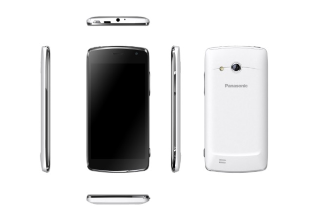
Panasonic has launched three new mid-range dual-SIM smartphones for the Indian market, the Panasonic P11, T11 and T21, all three of which are based on Android 4.1 Jelly Bean. Recently, the Panasonic P11 and Panasonic T11 were available through an online retailer. However, the Panasonic T21 is a new addition to the list. The company notes that all three smartphones will hit the stores from third week of September. The Panasonic P11 comes at a price point of Rs. 16,490, while the Panasonic T11 is priced at Rs. 9,790, and the Panasonic T21 at Rs. 13,990.
The Panasonic P11 comes with a 5-inch HD IPS display with a resolution of 720x1280 pixels. Other specifications include a 1.2GHz Qualcomm Snapdragon 200 quad-core processor, 1GB of RAM, 8.0-megapixel auto-focus rear camera and 2-megapixel front-facing camera. It comes with 4GB of inbuilt storage which can be further expanded up to 32GB with the help of a microSD card. The Panasonic P11 supports dual-SIM functionality (GSM+GSM) and includes a 2,000mAh battery. The device also sports changeable back covers.
The Panasonic T11 on the other hand features a 4-inch WVGA (480x800) IPS display, powered by a 1.2GHz Qualcomm Snapdragon 200 quad-core processor and 1GB of RAM. Other features include 4GB inbuilt storage (expandable up to 32GB via microSD card), 5-megapixel rear camera and 0.3-megapixel front-facing camera. Connectivity options on the Panasonic T11 include Wi-Fi, Bluetooth, GPS/ AGPS, GPRS, EDGE and Micro-USB. The device also supports 3G networks and is backed by a 1,500mAh battery.
panasonic-t-21-big.jpg
The last of the three smartphones, the Panasonic T21 is backed by a dual-core 1.2GHz Broadcom 28145 processor. There is 4GB of inbuilt storage, which is expandable up to 32GB via microSD card. It features a 4.5-inch HD (720x1280 pixel) IPS display and boasts a pixel density of 326ppi. Connectivity options on the device include Wi-Fi, Bluetooth, EDGE, GPRS and 3G. The device sports an 8-megapixel rear camera on board, along with a 2-megapixel front-facing camera. The Panasonic T21 is powered by a 1700mAh battery.
Commenting on the launch, Manish Sharma, Managing Director, Panasonic India said, "Panasonic's new offerings will deliver a remarkable mobile experience to our consumers and set a new standard in premium smartphones."

Mobiles launched in September 2013

Panasonic P11 key specifications
  • 5-inch HD (720x1280 pixel) IPS display
  • 1.2GHz Qualcomm Snapdragon 200 quad-core processor
  • 1GB of RAM
  • 4GB of inbuilt storage expandable up to 32GB via microSD card
  • 8-megapixel rear camera with auto-focus and LED flash
  • 2-megapixel front facing camera
  • Android 4.1 Jelly Bean
  • 2,000 mAh battery
  • Dual-SIM (GSM+GSM)
Panasonic T11 key specifications
  • 4-inch WVGA (480x800) IPS display
  • 1.2GHz Qualcomm Snapdragon 200 quad-core processor
  • 1GB RAM
  • 4GB inbuilt storage expandable up to 32GB via microSD card
  • 5-megapixel rear camera with auto-focus and LED flash
  • 0.3-megapixel front facing camera
  • Android 4.1 Jelly Bean
  • 1,500 mAh battery
  • Dual-SIM (GSM+GSM)
Panasonic T21 key specifications
  • 4.5-inch HD (720x1280) IPS display
  • 1.2GHz dual-core Broadcom 28145 processor
  • 1GB RAM
  • 4GB inbuilt storage expandable up to 32GB via microSD card
  • 8-megapixel rear camera with auto-focus and LED flash
  • 2-megapixel front facing camera
  • Android 4.1 Jelly Bean
  • 1,700 mAh battery
  • Dual-SIM (GSM+GSM)

Apple upgrades iMac family with Intel Haswell chips; starts from Rs. 99,900

iMac-haswell-new.jpg
Apple has announced the launch of the updated iMac all-in-one desktops with fourth generation Intel quad-core (Haswell) processors, new graphics, next-generation Wi-Fi and faster PCIe flash storage options. 
 
The entry-level 21.5-inch iMac features a 2.7GHz quad-core Intel Core i5 processor and new Iris Pro graphics for enhanced graphics performance, while the high-end 21.5-inch model and both 27-inch models feature quad-core Intel Core i5 processors up to 3.4GHz and NVIDIA GeForce 700 series graphics with twice the video memory and up to 40 percent faster performance than the previous generation, as claimed by Apple.
 
Customers also have the option of upgrading to quad-core Intel Core i7 processors up to 3.5GHz and NVIDIA GeForce GTX 780M series graphics with up to 4GB of video memory.
 
The iMac comes standard with 8GB of memory and a 1TB hard drive, and customers can choose to configure their iMac with up to 32GB of memory and up to a 3TB hard drive. iMac also comes with two Thunderbolt and four USB 3.0 ports for connecting to external storage and other high performance peripherals.
 
Just like the new MacBook Air devices that were unveiled in June, the iMac now supports next generation 802.11ac Wi-Fi. When connected to an 802.11ac base station, iMac delivers wireless performance that is up to three times faster than the previous generation, according to Apple.
 
The iMac now also features support for PCIe-based flash storage that makes Fusion Drive and all-flash storage options up to 50 percent faster than the previous generation. The popular Fusion Drive option combines the large storage capacity of a hard drive with the high performance of flash to deliver shorter boot times and faster access to apps and files. Customers can configure their iMac with a 1TB or 3TB Fusion Drive, and all-flash storage options are now available in configurations up to 1TB.
 
"iMac continues to be the example that proves how beautiful, fast and fun a desktop computer can be," said Philip Schiller, Apple's senior vice president of Worldwide Marketing. "Inside its ultra-thin aluminium enclosure, the new iMac has the latest Intel processors, faster graphics, next generation 802.11ac Wi-Fi and faster PCIe flash storage."
 
The iMac ships with OS X Mountain Lion, that offers Messages, Notification Center, system-wide Sharing, AirPlay Mirroring, Dictation, Game Center and the enhanced security of Gatekeeper. 
 
iCloud is integrated with OS X, Mountain Lion making it easier to keep content up to date across the customers' Mac, iPhone, iPad and iPod touch.
 
The 21.5-inch iMac is available with a 2.7 GHz quad-core Intel Core i5 with Turbo Boost speeds up to 3.2 GHz and Intel Iris Pro for a suggested retail price of Rs. 99,900 inclusive of VAT, and with a 2.9 GHz quad-core Intel Core i5 with Turbo Boost speeds up to 3.6 GHz and NVIDIA GeForce GT 750M for a suggested retail price of Rs.1,14,900 inclusive of VAT. 
 
The 27-inch iMac is available with a 3.2 GHz quad-core Intel Core i5 with Turbo Boost speeds up to 3.6 GHz and NVIDIA GeForce GTX 755M for a suggested retail price of Rs.1,39,900 inclusive of VAT and with a 3.4 GHz quad-core Intel Core i5 with Turbo Boost speeds up to 3.8 GHz and NVIDIA GeForce GTX 775M for a suggested retail price of Rs.1,54,900 inclusive of VAT. 
 
The previous generation 21.5-inch iMac was priced at Rs. 85,900 and upwards, while the 27-inch version was priced at Rs. 1,22,900. Apple doesn't usually increase prices of new iterations of Mac products when it introduces them. However, it's likely that the increased pricing of the new iMac is due to the diminishing value of the Rupee against the Dollar.
 
The new iMac is available starting today through select Apple Authorised Resellers. 
 
Technical Specifications (Base model, Rs. 99,000)
  • 21.5-inch (diagonal) LED-backlit display with IPS technology; 1920-by-1080 resolution
  • 2.7GHz quad-core Intel Core i5 processor (Turbo Boost up to 3.2GHz) with 6MB L3 cache
  • 8GB (two 4GB) of 1600MHz DDR3 memory
  • 1TB (5400-rpm) hard drive
  • Intel Iris Pro graphics
  • FaceTime HD camera
  • Stereo speakers
  • Dual microphones
  • Headphone port
  • SDXC card slot
  • Four USB 3 ports
  • Two Thunderbolt ports
  • Mini DisplayPort output with support for DVI, VGA, and dual-link DVI (adapters sold separately)
  • 10/100/1000BASE-T Gigabit Ethernet (RJ-45 connector)
  • Apple Wireless Keyboard/ Magic Mouse/ Magic Trackpad
  • 802.11ac Wi-Fi wireless networking
  • Bluetooth 4.0 wireless technology
  • OS X Mountain Lion
  • Height: 17.7 inches (45.0 cm)
  • Width: 20.8 inches (52.8 cm)
  • Stand depth: 6.9 inches (17.5 cm)
  • Weight: 12.5 pounds (5.68 kg)
 
Technical Specifications (27-inch, Rs. 1,39,900)
  • 27-inch (diagonal) LED-backlit display with IPS technology; 2560-by-1440 resolution
  • 3.2GHz quad-core Intel Core i5 processor (Turbo Boost up to 3.6GHz) with 6MB L3 cache
  • 8GB (two 4GB) of 1600MHz DDR3 memory
  • 1TB (7200-rpm) hard drive
  • NVIDIA GeForce GT 755M graphics processor with 1GB of GDDR5 memory
  • FaceTime HD camera
  • Stereo speakers
  • Dual microphones
  • Headphone port
  • SDXC card slot
  • Four USB 3 ports
  • Two Thunderbolt ports
  • Mini DisplayPort output with support for DVI, VGA, and dual-link DVI (adapters sold separately)
  • 10/100/1000BASE-T Gigabit Ethernet (RJ-45 connector)
  • Apple Wireless Keyboard/ Magic Mouse/ Magic Trackpad
  • 802.11ac Wi-Fi wireless networking
  • Bluetooth 4.0 wireless technology
  • OS X Mountain Lion
  • Height: 20.3 inches (51.6 cm)
  • Width: 25.6 inches (65 cm)
  • Stand depth: 8 inches (20.3 cm)
  • Weight: 21 pounds (9.54 kg)

Samsung Galaxy Gear smart watch: First impressions

samsung-galaxy-gear-635-02.jpg
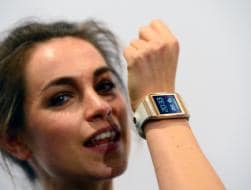
The Galaxy Gear, a wearable computing device from Samsung that looks like a digital wristwatch, is certain to pique much curiosity when it starts being worn in public. The intensely black rectangular screen and orange strap on the wrist of a Samsung executive immediately caught my eye as she entered a corporate meeting room to give a preview of the gadget.
Samsung will start shipping the $299 Gear smartwatch in September, ahead of a similar product expected from Apple. I had a chance to play with a pre-production unit for about 10 minutes and briefly with the version that Samsung announced Wednesday in Berlin on the eve of the annual IFA consumer electronics show.
Like similar products already being sold, the Gear is not an independent device. For useful functionality, the Gear needs to be linked with a specific Samsung smartphone or tablet computer. The pairing is done wirelessly over a Bluetooth connection built-in to both sides.
The Gear's display is a touch screen measuring 1.63 inches diagonally. Its strap has an embedded camera. The Gear supports apps such as Facebook and lets the wearer answer incoming calls or check email without picking up the smartphone that's paired with it. The Gear is not the smartwatch disclosed in recent Samsung patent filings with a flexible display.
With smartphones and tablets now ubiquitous, the mobile phone industry is creating a new category of products to wow consumers. Many believe the next big step for consumer electronics is advanced computing technology in everyday objects such as wristwatches and glasses.
Sony introduced its latest SmartWatch in June and unveiled an update Wednesday. Google is working on Google Glass - a device designed to work like a smartphone and worn like a pair of glasses. Apple is seeking an iWatch trademark. Meanwhile, the response to projects such as Pebble, a smartwatch that received more than $10 million in investment pledges through funding website Kickstarter, also attests to the public interest in this trend.
It didn't take me long to see what Samsung is trying to achieve. It wants to attract not only tech addicts who must have the latest gadget but also young, design-conscious consumers. The Gear's design flair and ease of use are its sweetest attributes, but it may not entirely please either group. Although powered by the Android operating system, like many phones and tablets, it will work only with Samsung devices - and only with newer models.
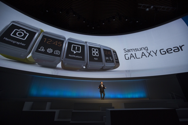
At about twice the price of the Sony SmartWatch and the Pebble, Gear boasts a camera, a speakerphone and plenty of apps - about six dozen, according to Samsung. Apps include Twitter and sports services such as RunKeeper, which tracks runs and other workouts. These are all great features, but the 1.9 megapixel camera is of poorer quality than a typical smartphone camera. In addition, moderate use of the device will require a daily battery top-up with yet another charger to keep track of.
I can imagine wearing the Gear with a casual dress or a formal outfit. It is sleek, with a thin metallic bezel surrounding the display. The strap comes in six different colors. But the screen, which is pitch black in idle mode, probably draws more attention than a tasteful accessory should. The dark recess in the strap where the camera's lens is embedded will also elicit questions from the curious.
samsung-galaxy-gear-635-03.jpg
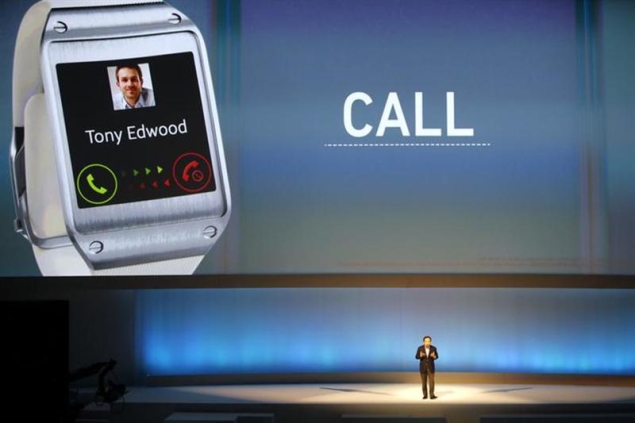
In terms of what the Gear can do, the three features I tested worked efficiently. It was easy to activate the camera and quick to shoot a photo. It left both hands free while placing and answering calls. The Gear alerted me with a nice soft buzz and showed a preview of a newly arrived email. The full message can also be read.
Taking photos felt natural except at very high or low angles, which forced the wrist into an awkward position.
I found easy navigation of the touch screen one of the device's biggest pluses. Samsung has dispensed with buttons on the screen, so there's no home or back button. There is a button on the top right edge of the smartwatch face. Pressing it turns the display into a clock. One tap anywhere on the screen takes and saves a photo in Gear and the smartphone that's paired with it. In clock mode, one swipe from bottom to top pulls up a numeric keypad.
Swiping from left or right shows a list of icons, including the S Voice, Samsung's equivalent of Apple's Siri digital assistant that responds to voice commands. You also get a list of emails and notifications from social networking apps. At any time, tapping the screen twice with two fingers conjures a pop-up window that shows the time, the weather and the amount of battery left.
With the combination of S Voice and the speakerphone in the strap, placing and answering calls was much easier than a smartphone. I tested it in a noisy setting and I had to speak to the Gear more than once to set an alarm in my smartphone or to look up a contact to place a call. But it did work without too much effort. I didn't have the device for long enough to test how well it worked when not very close to the smartphone.
One downside is that the Gear doesn't support a wireless earpiece, so both sides of any conversation can be overheard.
The big disappointment for Samsung gadget owners is that Gear does not work with most of its phones and tablets. The Gear needs the Galaxy Note III, a smartphone with a giant 5.7-inch screen and a digital pen, and the Galaxy Tab 10.1, a tablet computer. Both will go on sale later this month. At a later date, it will be compatible with the Galaxy S4, released earlier this year, and the Galaxy Note II, which came out late last year.
In some countries, mobile carriers will bundle the Gear with the Note III on a two-year contract. In other places, consumers will be able to buy the Gear without a phone contract.
Overall, the Gear gives us more ways to imagine what wearable computing gadgets might do for us in the future. Gear is smart but in a limited way, as it's essentially a slave to the smartphone it's paired to.
After my brief hands-on experience, I decided the first generation of the Gear was cool but not compelling enough to convince me to ditch my current device, an iPhone.

Nokia Lumia 625 review


nokia-lumia-625-main.jpg
The Lumia 625 is Nokia's first large screen Windows Phone smartphone, in line with the current trend of big screen phones, which was ignited by Android OEMs. Clearly, Nokia wants to cover all segments with a range of devices and form factors. The Lumia 625 is currently the largest screen Nokia Windows Phone 8 devices at 4.7-inches, larger than the flagship Lumia 920 and 925, which have 4.5-inch displays.

Nokia's Lumia 625 improvises on the Lumia 620, and offers a bigger screen packed in a pleasantly built casing. However, it's targeted at people looking for a value for money smartphone. Keeping this is in mind, it is fitting that Nokia has cut corners in a number of areas to keep the price of the phone low. Despite this, does the Lumia 625 manage to deliver on all fronts? Is it the first big screen Windows Phone handset that will lure people away from Android phablets? We find out in our review.  

Build / Design
Judging by the nomenclature and just looking at the phone from some distance, the Nokia Lumia 625 appears to be the bigger version of the Lumia 620. However, on closer inspection you'd see a number of differences, such as a sleeker and more refined form factor. Also, unlike the Lumia 620, the 625's back cover doesn't wraparound the display or show up along the edges of the front panel.

Like some of the earlier phones of the Lumia product line, the phone is available in multiple colours, including Black, White, Yellow, Green, and Orange. The Lumia 625's colour is rendered purely by the back cover, which as we mentioned earlier, wraps around most of the phone, barring the display and front panel.

nokia-lumia-625-back.jpgSimilar to the Lumia 620, Nokia uses a 'dual-shot' layering technique with the Lumia 625's back cover, which helps in creating new colours and textures for this smartphone. The 'dual shot' finish implies two layers of polycarbonate, a single base layer in one colour, and a second translucent layer in another colour, to produce depth effects and secondary colour blends. For example, Yellow and Cyan are combined to produce a lime Green colour. We had a Yellow colour phone as our review unit.

The finish on the cover is better than that seen on the Lumia 620, with an overall matte finish. 

The Lumia 625 also sports a more natural pillow-like form factor, with more rounded edges compared to other devices in the Lumia family. On the whole, the phone feels really good to hold thanks to the improved ergonomics.

The front of the Lumia 625 is dominated by the 3.8-inch screen, with the three capacitive Windows Phone buttons - Back, Start and Search - sitting below it, while the front camera lens, light and proximity sensors and the earpiece are located above it. There's minimalist Nokia branding at the centre. Unfortunately, the capacitive keys are not backlit, most likely done to save costs. This may become a problem in low-light scenarios, though understandably, the user could after a teething period, operate the phone by feel.

The back of the Lumia 625 features the rear camera lens and the LED flash. There's a small hole for the speaker grill and the speaker is located inside it. This design ensures the speaker is not too close to the surface, preventing the muffling of sound.
 
The right side of the Lumia 625 features the volume rocker, power button/screen-lock key, and a camera button, all in plastic and in the same colour as that of the phone's rear shell - unlike the Lumia 620's black-coloured keys.

The Lumia 625's keys were responsive, but do not really offer good tactile feedback. At times, we instinctively looked for the power button towards the upper part of the right side, however, this is where the volume rocker is located - this may take some getting used to for some users, but is not a serious usability issue. There are no keys or ports at the left side of the phone. The Micro-USB port and the primary microphone are located at the bottom, while the 3.5mm headphone jack sits on the top of the Lumia 625.

nokia-lumia-625-side.jpgThe back cover of the Lumia 625 is secured so tightly that the phone's construction is easily mistaken as unibody. After spending some time trying to figure out the trick to open the device, we realized that you just need to exert some pressure at the middle and remove the case with the rest of your fingers from the bottom. Credit goes to Nokia for making the cover latch on the phone in such manner that there are no creaks and wobbles at all.

Unlike the Lumia 620, the 625's 3.5mm jack is not integrated with the cover, and users will be able to use the port even if the cover has been removed. 

Removing the Lumia 625's cover reveals a sealed battery compartment. Yes, the battery cannot be replaced by the user. Towards the right hand side you'd find a stacked micro-SIM card and microSD card slot, which could be a little confusing for a user, making both the cards relatively inaccessible, and tedious to insert. 

Overall, the Lumia 625 feels solid yet pleasing to hold and see, making it one of the best in its segment.

Display
The Nokia Lumia 625 features the biggest display ever seen on a Nokia phone. Measuring 4.7-inches diagonally, the IPS LCD display sports a resolution of 480x800 pixels (giving it a pixel density of just 199ppi), which unfortunately defeats the purpose of a big screen. The low resolution display makes images and text appear pixelated. Even the Live Tiles on the phone's Start screen appear pixelated when you look at them closely. We also noticed some backlight leakage from the bottom edge. We're not sure if the issue is just limited to our review unit, however.

nokia-lumia-625-display.jpgNokia has cut corners in this department and it shows. The Lumia 625's big screen should ideally have been a value-add boosting the phone's video playback capabilities but the low resolution makes it much less attractive.

We also found the brightness levels to be much lower and colours a tad dull, compared to devices like the Lumia 925. The sunlight legibility of the phone's screen is decent, despite the panel being a bit reflective. Viewing angles were average as well. Ironically, the Lumia 625's big display is among its biggest weaknesses.

Camera
The Lumia 625 sports a 5-megapixel rear camera with LED flash. The Windows Phone 8 camera app on the phone allows you to tinker with various settings including selecting scenes, camera effects, ISO, white balance, contrast, saturation, flash and sharpness, among others. Windows Phone 8 brings camera lens apps that extend the functionality of the camera. The Lumia 625 ships with Bing Vision, Cinemagraph and Smart Cam lenses. 

The 625's camera turns out to be another weakness for the phone. Pictures taken outdoors in good light turned out to be decent in terms of clarity and detail, but we noticed that they were not as bright as the actual scene where they were shot - the photos tend to be a little underexposed. Pictures taken indoors came out really grainy and missed out on details. Low light photos also didn't come out well and there was a high level of noise.

Lumia625-camsample1.jpgColour reproduction was satisfactory, with objects appearing close to their true colour. We also found a minor lag in the Lumia 625's shutter timings compared to high-end phones and focus went haywire at times. The phone's video recorder allows taking 1080p videos at 30 frames per second, and we found the videos taken with it to be pretty decent.

Lumia625-camsample2.jpgThe Lumia 625 also features a VGA front-facing camera which is functional at best, and can be used for video chat with apps like Skype or Tango. 

Software / User Interface
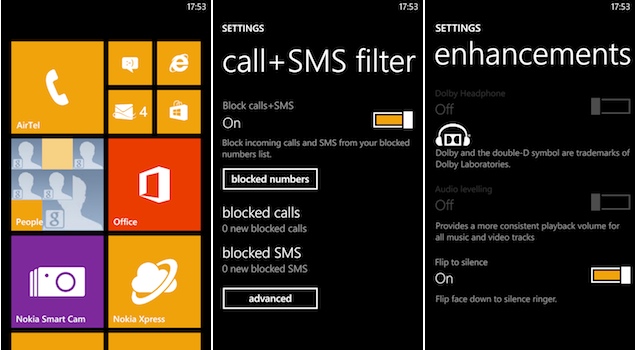
The Lumia 625 comes with Windows Phone 8 featuring the Amber update that is essentially the Windows Phone GDR2 update with Nokia's own tweaks. While the update doesn't bring any major changes in terms of the user interface or features, it does bring FM radio, improvements to the camera software, the Smart Cam app, the flip to silence gesture, and some other minor changes including the Data sense app (which helps you to keep a tab on your data usage) now being compatible with all carriers and the ability to block calls and SMS. The GDR2 update also brings the Glance screen feature and the double tap to unlock gesture, but both of these are not available in the Lumia 625.

The Amber update also brings support for Google services for Calendar and Contacts through CalDAV and CardDAV, and for Gmail through IMAP. This means that it's future proof and users will continue to be able to use these services after Google ends support for Exchange Active Sync which pre-GDR2 phones use. We were able to use Gmail smoothly and received emails via Push without any hiccups.

Other than these new features, Windows Phone 8 has not changed much compared to its first iteration.

nokia-lumia-625-UI.jpgUnlike Android, Windows Phone 8 doesn't offer much flexibility to the manufacturer in terms of customising the OS, however Nokia has included its own apps that may well prove to be the differentiator compared to the competing Windows Phone 8 devices.

The Lumia 625 comes with several exclusive (and non-exclusive) Nokia apps, such as HERE Drive, HERE Maps and Nokia Music, as well as other Nokia apps like Nokia Care and HERE City Lens. We love the HERE Drive app that offers offline navigation complete with turn-by-turn directions. As we mentioned in our previous reviews, Nokia continues to set the benchmark in navigation apps, even ahead of Google Maps.

The other services included on the Lumia 625 are HERE Maps, which is a huge improvement over the stock Bing Maps, and Nokia Music, that offers unlimited music free for six months. The software suite on the phone also includes the mobile version of Microsoft Office, Skype integration and a great native email client.

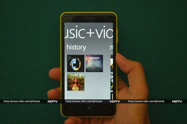
nokia-lumia-625-music.jpgAs mentioned in the Camera section, the phone comes with some lenses, which also show up as stand-alone apps (Bing Vision, Cinemagraph, and Nokia Smart Cam). PhotoBeamer is another interesting app that lets you beam your photos to any computer over Wi-Fi, providing an instant, wireless slideshow you can see over a large screen. During our tests, this worked as advertised.

We also love the software keyboard on the Lumia 625, which is the standard Windows Phone 8 keyboard, and the size of the display definitely helps making it user-friendly even for those with thick fingers. 

The Lumia 625 also comes with a host of pre-installed apps like BIGFLIX (entertainment), BookMyShow (for booking movie/concert tickets), Cosmopolitan (lifestyle magazine), Flipkart eBooks, TripAdvisor (travel guide) and Zomato (food/restaurants guide). The phone also includes You Movies which offers free movies for a period of three months. The app boasts of 3,000 Hollywood, Bollywood, Tamil, Telugu, Marathi, Kannada, Malayalam, Gujarati, Bengali and Bhojpuri movie titles and lets users download the full movie for offline viewing. The app is not available in the Windows Phone Store at the time of writing this post.

The Lumia 625 also offers Draw Something and Words With Friends games, that come preinstalled.

However, the annoyances with the Windows Phone 8 OS still remain. The biggest among them is the lack of quality apps. Many mainstream apps including Instagram, Path and even Pocket are absent from the Windows Store, though you can find some third-party alternatives. For instance 6tag is a nice third party app for Instagram. The new Facebook app now levels up to its Android and iOS counterparts while the native Twitter app is also good enough.
The lack of a centralised notification tray/ hub is still a pain point. The 'Me tile' tries to fill that gap, at least for social networking needs, but the experience is a little crippled. For instance, it's not possible to do a reply all for tweets.

Performance / Battery Life
The Lumia 625 is powered by a 1.2GHz dual-core Snapdragon S4 processor with 512MB of RAM and Adreno 305 graphics. It comes with 8GB of built-in storage, which is expandable by another 64GB via a microSD card. Windows Phone 8 is not a power hungry OS and the hardware has been optimised for good performance. We did not experience any lag at all while launching apps, playing games, scrolling web pages in Internet Explorer or switching between apps. We were able to play games like Asphalt 7 and Gravity Guy without experiencing any issues. However, it's worth pointing out that not all games will work on the phone due to its limited memory. 

As for video playback, we were able to play Full HD clips on the Lumia 625, and all formats (barring MKV) were natively supported by the phone. The speaker delivers decent quality sound at high volume levels, and the loudness is above average. The speaker grill is placed inside a hole at the back; so, as we mentioned earlier, while the sound doesn't get muffled when the phone is placed on a hard surface, it does get affected otherwise.
Playing videos and music through the memory card was really smooth, though the Lumia 625 did take some time to read the card. Windows Phone 8 supports Bluetooth file transfers but we faced some issues transferring large image files from a Galaxy Nexus.  The phone does not include NFC connectivity.

nokia-lumia-625-cover.jpg  
The Lumia 625's call quality was top-notch and the phone was able to easily latch on to the network even in weak signal areas. We were very satisfied with the network reception, and there were no call drops. 

The phone comes with a 2,000mAh battery, and in our usage, it lasted us a full working day. We charged the Lumia 625 in the morning, and our usage ranged from medium to heavy, including 1-1.5 hours of phone calls, three e-mail accounts with push notifications, playing some music (both on the phone and via Internet radio), Twitter notifications and WhatsApp chats. It's worth pointing out that we had turned off Wi-Fi and auto-brightness, and the phone was hooked to a 3G network with the screen brightness at the highest level. Altering these settings might help in running the phone for a longer duration, depending on your usage pattern.

Verdict
With the Lumia 520, 620 and 720, Nokia has in a way already addressed the budget and the mid-range smartphone segments. However, with the Lumia 625, the company is trying to target users who demand a large screen at a price that doesn't burn a hole in their pockets. In the Indian market, domestic brands like Micromax, Karbonn and Lava already offer Android smartphones that come in 5-inch+ screen sizes, in the budget and mid-range segments.

nokia-lumia-625-box.jpg
Samsung's Galaxy Grand Duos is also a popular big screen phone/phablet. Perhaps Nokia wanted to address this very segment of consumers. However, at a price point of Rs. 20,000, we're not sure if consumers would opt for the Lumia 625, majorly because of its mediocre specifications. It offers a big screen but the low-resolution is a major dampener. The phone's camera is also not that great, and to cut costs Nokia has removed NFC functionality and even sensors like compass and gyroscope, which means you won't be able to use apps like Nokia City Lens. 

Nokia has priced it above the Lumia 720, which in our opinion is a better phone. This might be due to the impact of the diminishing value of the Rupee against the Dollar, but we'd still recommend buying a Lumia 720 over the 625.

If you're open to buying a large-screen Android phone at that price range, then there are a number of options that you could consider including the Panasonic P51 and the Sony Xperia SP.

Price: Rs. 19,999


Nokia Lumia 625: In pictures


  Pros
  • Great build quality
  • Decent battery life
  • Bundled apps

Cons
  • Low resolution display
  • No gyroscope, compass
  • Performance limited by RAM
  • App ecosystem not at par with Android and iOS

Ratings (out of 5)
Design: 4
Display: 2.5
Camera: 3
Performance: 3.5
Software: 3.5
Battery Life: 3.5
Value for Money: 3
Overall: 3

Sony Xperia Z Ultra review


sony-xperia-z-ultra-635.jpg
"Maybe Dell was ahead of its time."
No, that's not a typo, we did mean to write Dell. When we first saw the Sony Xperia Z Ultra, we couldn't help but think back to the Dell Streak, a 5-inch device announced back in 2010 as a "tablet that can make calls." While calling 5-inch devices 'tablets' seems ridiculous now, in the pre-Galaxy Note era, people had a different mindset about display sizes that were acceptable on a device that's designed to sit in your pocket. The Dell Streak was almost universally panned, and while the poor execution probably had as much to do with it, as the size of the display itself, it's fair to say that the Dell Streak would probably get a more favourable reception now, and in fact, may even be called 'not big enough' by some!
Yes, that's how radically the landscape has changed in the last three years, and it is in this world that the Sony Xperia Z Ultra makes its debut. While we are personally no fans of ultra large-screen phones, we realise a market exists for such devices, even if the likes of Xperia Z Ultra and Huawei Ascend Mate are intent on stretching the acceptable limits.
So, has the Sony Xperia Z Ultra gone too far, or does it tick the right boxes? Let's find out.
Design/ Build
At first glance, the Sony Xperia Z Ultra looks like a slab of premium chocolate - it sports the same rectangular design, and is about the same thickness, and the Black colour variant looks especially biteable. Pick up the phone and try getting your fingers around the width of its display and you realise that the phone just about fits in your hand, if you have big hands that is. If you have a tiny frame, forget about trying to get your fingers around the sides of this monster. Don't even think about trying to operate the phone with just hand, unless you have it resting on a surface.
The Xperia Z Ultra is a big phone, which stretches the definition of the phrase big phone. At 179mm, or an incredible 7.05-inches long, even those with large hands will be unable to fit the length of the phone in one hand. If you plan to, say, watch a movie on the phone in landscape mode, forget about snuggling this behemoth in one hand - putting both your hands to use is a must.
Once you get past the sheer size of the phone, you realise that the Xperia Z Ultra is one solidly-built device. The phone has a plastic body built around a metallic frame, which lends it an air of solidity, and a premium feel when holding the device. At just 6.50mm thin, Xperia Z Ultra is sleek, and indeed the 'slimmest full-HD smartphone', as Sony loves to claim. In a phone that's super-sized on everything else, this comes as a very welcome change.
Carrying the Sony Xperia Z Ultra is a challenge of its own. Some may be able to fit it in the front pocket of their trousers or jeans, but will have to take it out if they want to sit without being constantly poked. Keeping it in the back pocket is an option, but the Ultra is sure to stick its neck out - and beware of accidentally sitting down with the phone still in your pocket!
sony-xperia-z-ultra-sides.jpg
The left edge of the Xperia Z Ultra has the dock connector in the middle and the Micro-USB port towards the top. Since the Xperia Z Ultra is a waterproof phone (a claim we were not tempted to test), the Micro-USB port and the microSD and Micro-SIM slots (present on the right edge) are protected by flaps. The right edge also houses the power button (in the middle) and, right below it, the volume rocker. The power button is a circular, metallic button also seen on the Sony Xperia Z and the Sony Xperia Z tablet. While the design makes the power button stand out visually, it also greatly reduces the target area of the button, and we would've preferred a larger button made of plastic.
sony-xperia-z-ultra-power.jpg
Display
The Sony Xperia Z Ultra comes with a 6.44-inch full-HD display with a resolution of 1080x1920 pixels. While the pixel density takes a hit due to the humongous screen size, at around 340ppi, most won't notice the difference in the quality of text and images, though the display is definitely not as sharp as the one seen in, say, the HTC One.
Outdoor visibility of the Xperia Z Ultra is about average, and at times we were definitely wishing we could take the brightness a notch higher, even when at full brightness. Viewing angles are good.
sony-xperia-z-ultra-12-635.jpg
Sony has put the extra real estate on the Xperia Z Ultra to good use, with a strip at the bottom housing the three on-screen Back, Home and App Switcher buttons, and still leaving more than enough space for content. One side-effect of the Xperia Z Ultra's extra-large display is that at times the content looks odd when scaled up. For example, in the official Twitter app the four columns appear extra-wide.
While the Sony Xperia Z Ultra does not bundle a stylus, the screen will recognise taps from a stylus, or even a pen or a pencil, if you prefer to use your device in that manner.
Camera
The camera on the Sony Xperia Z Ultra is a bit of a mixed bag. The images look good on the phone's display or when you are viewing images at the default zoom level. However, zoom in to 100 percent and you'll notice that the objects lack detail that even our two-year old iPhone 4S was able to capture. This problem gets accentuated when clicking pictures in macro mode.
DSC_0010.jpg
However, the low-light and indoors performance of the camera is better than what we've seen in most phones, though the Xperia Z Ultra won't have the leaders of the pack in the category, the iPhone 5and Nokia Lumia 925, looking over their figurative shoulders.
The Ultra comes with a comprehensive camera app, with presets and settings for pretty much every conceivable situation. The phone takes good, fast panorama photos and comes with an unlimited burst mode. The phone does not come with a flash, which is a rather glaring omission.
DSC_0008.jpg
The Xperia Z Ultra captures good quality video, with the ability to zoom in and out, and capture high-resolution stills as the video is being recorded. The microphone is pretty sensitive, and able to capture distant sounds while recording outdoors.
Software/ User interface
The Sony Xperia Z Ultra runs Android 4.2.2 Jelly Bean and we reviewed our unit after installing therecent firmware update carrying build number 14.1.B.0.471.
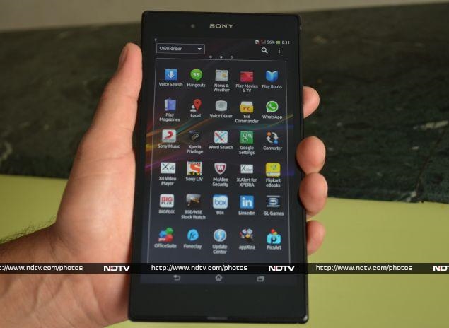
The Ultra is quite heavy on skinning, customising stock apps and adding a number of pre-installed apps. Like other devices in the Xperia series, you have WALKMAN (for Music), Album, and Movies for media consumption, all with additional functionality and UI touches from Sony. Other pre-installed apps on the Xperia Z Ultra include Socialife (A Flipboard-like app from Sony), TrackID (Sony's answer to Shazam), Wisepilot for XPERIA (GPS-based navigation app), File Commander (a file explorer), Voice Dialer, Word Search, Converter, X4 Video Player (lets you play four videos simultaneously), McAfee Security, Foneclay (live wallpapers), PicsArt (photo editor), Smart Connect (perform actions when certain accessories are connected), X-Alert for XPERIA (Sony's anti-theft solution), Notes, and Drag&Share. The list of bundled apps doesn't end there, with popular apps like Facebook, Chrome, YouTube, WhatsApp, Box, and LinkedIn thrown-in for good measure.
If all that isn't enough, Sony has included a bunch of other apps on the Xperia Z Ultra that offer you access to yet more apps and content. Sony Music gives you free unlimited streaming and downloads from Sony's music catalog of Bollywood, international and classical music for a period of 6 months. Sony Select and appXtra showcase popular Android apps, while Xperia Privilege promises special offers for Xperia owners. One of the more useful ones is GL Games, which showcases games by popular developer Gameloft, with popular titles like Asphalt 7: Heat (usually $0.99 or Rs. 55) offered for free to Xperia Z Ultra owners.
sony-xperia-z-ultra-13-635.jpg
The Indian edition of the Sony Xperia Z Ultra also comes with apps like Sony LIV (free streaming of popular TV programmes from Sony, SAB and MAX), Flipkart eBooks (free eBooks worth Rs. 2,000 bundled), BIGFLIX (with free unlimited streaming of Bollywood and regional Movies for one month), and BSE/NSE Stock Watch. That's a lot of pre-installed apps, and while some of them can be removed, the others will stay with you for good, should you have any use for them or not. We wish Sony had instead pre-installed a single app that offered users the opportunity to download apps it wishes to offer, letting users choose which apps they want.
As mentioned earlier, Sony Xperia Z Ultra runs Android 4.2.2 Jelly Bean, which brings features like lock-screen widgets, enhanced notifications, improved Google Now and more. While Android 4.2 may seem like a disappointment to some, it is hardly a surprise given that the phone was unveiled a day after Google announced Android 4.3, and no phones other than Google's own Nexus devices andGoogle Play editions have received the Android 4.3 update. Sony has promised that the Android 4.3 update is coming before end of this year, but Android 4.4 might be out by then. That, of course, is no reflection on Sony, and merely symptomatic of the problems that plague the Android ecosystem.
Performance/ Battery life
Sony Xperia Z Ultra is powered by a 2.2GHz quad-core Qualcomm Snapdragon 800 processor alongside 2GB of RAM. It's safe to say it is the fastest device we've come across, handling everything that we threw at it with great aplomb. From multi-tasking and switching between apps, to casual as well as heavy duty games, everything was butter smooth.
Browsing the Web is a great experience thanks to the large screen and the power underneath, which means even heavy duty websites render almost instantly. The phone's also great for watching videos and the Ultra plays full-HD video natively. If you do a lot of media consumption, be mindful of the fact that you'll need to use both your hands to hold the phone in landscape mode. Thankfully, the phone doesn't feel too heavy despite weighing 212 grams, since the weight is evenly distributed across its large frame.
sony-xperia-z-ultra-17-635.jpg
We did have a couple of other gripes about our Xperia Z Ultra unit. The call quality was average at best and we felt that the loudspeaker wasn't loud enough during calls as well as while watching a movie or listening to music.
Battery life is another area where the Xperia Z Ultra just about does the job and it should last a full working day with moderate to heavy use. The giant display on the device is a bit of a battery guzzler and power users will likely find themselves reaching for the charger before the day is over.
Verdict
The Sony Xperia Z Ultra is a difficult phone to summarise. It gets a lot of things right - it's a scorcher in terms of performance and the big, full-HD display makes for a great viewing experience. However, it's too bulky for most people, and the large display means the battery life takes a hit. The camera performance could've been better too.
At Rs. 46,990, the phone isn't cheap, but that's no surprise given its top-of-the-line specs and performance. Almost everyone we met was excited about the Xperia Z Ultra when they first heard about it or saw it in person. Ten minutes with the phone, though, changed the opinion of 9 out of 10 people and they were calling it 'impractical' in no time. However, the tenth person immediately vowed to get one for himself.
That, in a nutshell, is the Sony Xperia Z Ultra - too bulky for most, perfect for a minority who believe big is indeed beautiful.
Price: Rs. 46,990
Pros
  • Brilliant performance
  • Good display
Cons
  • Battery life could be better
  • Clicked pictures lack detail, no flash
  • Too bulky for most
Ratings (out of 5)
  • Design: 4
  • Display: 4
  • Camera: 3.5
  • Performance: 4.5
  • Software: 4
  • Battery Life: 3
  • Value for Money: 3.5
  • Overall: 4