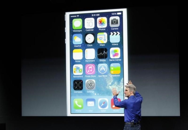
The changes to Apple's iOS software became apparent as I drove to the headquarters of the company's rival, Google. As I navigated using Apple's mapping app, I noticed one of my favorite attributes was missing: the directions for each next turn presented in green boxes that resemble highway signs.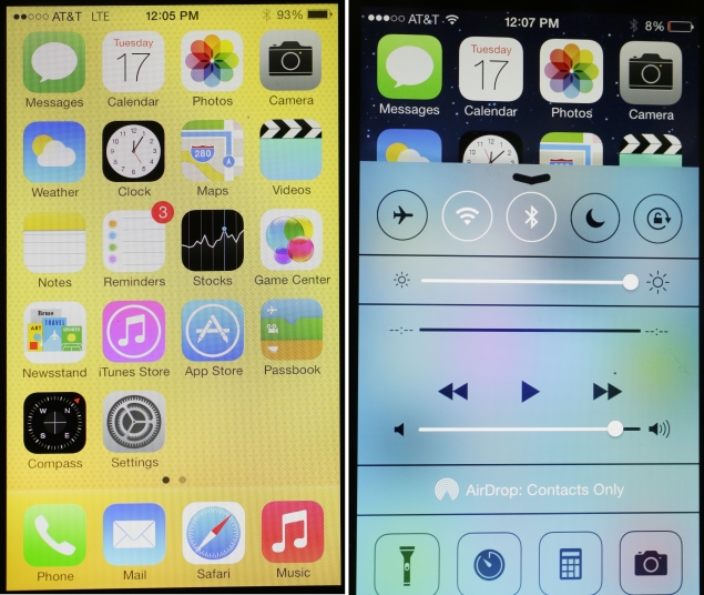
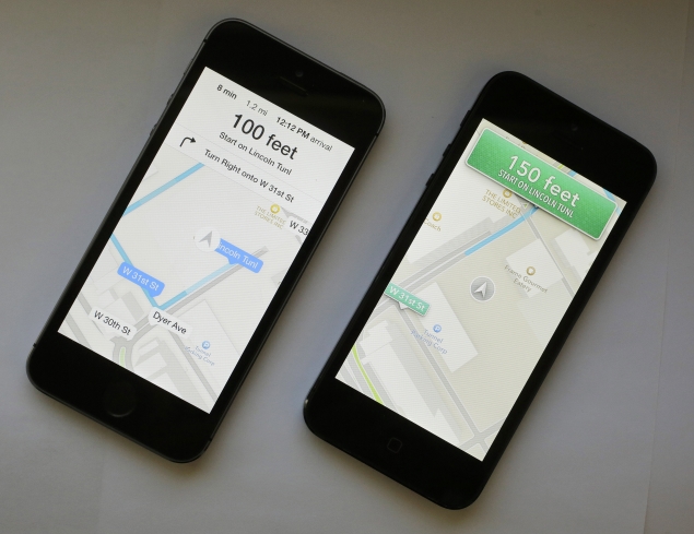
Many of the changes in Apple's operating system for mobile devices are cosmetic. Gone are three-dimensional icons that mimic real-world counterparts, such as a magazine rack for the Newsstand app. They are replaced by larger, two-dimensional icons sporting abstract designs and pastel colors. Apple also extended that new look to many of its apps. In Maps, the green boxes are replaced with solid white across the top.
It didn't take long to realize that deeper down, the new iOS 7 software is the same as the one I've come to know.
The new software does have several functional improvements, but those take time to stumble upon. The good news is that even if you never discover them, you can still use your device the way you did before. The free update is available starting Wednesday.
I'm covering the features specific to Apple's new iPhone 5s and iPhone 5c in a separate review. This one is about whether it makes sense to upgrade to iOS 7 on your existing iPhone or iPad.
(Also see: Apple unveils iPhone 5c and iPhone 5s)
The biggest functional change is the use of swipes instead of taps to access key functions. You can already swipe up from the bottom right side of the screen to quickly access the camera when your phone is locked. With iOS 7, you can also swipe up for the Control Center, which contains frequently used settings and apps. That's available whether or not the phone is locked.
Swipe down from the top of the screen to get recent notifications and the day's highlights, including the weather, appointments, reminders and stock quotes. Swipe down from the center of any home screen for a search box. From many apps, you can swipe from the left or the right instead of tapping the left and right buttons.
The Control Center is the most useful of the functional improvements.

From there, you can turn Airplane Mode, Wi-Fi and Bluetooth on and off. Before, you had to find those switches in the settings. That would have come in handy for my flight to Silicon Valley last week for Apple's event introducing the new phones and software. Likewise, a Do Not Disturb feature is easier to access. It lets you silence incoming calls and messages, though you can make exceptions for certain numbers or for those calling repeatedly, in case there is a true emergency.
The Control Center also lets you easily control music playback and adjust the screen's brightness. It gives you quick access to a flashlight feature, the clock, a calculator and camera. My only complaint: You can't pick the apps featured and replace the calculator, for instance, with Facebook or Gmail.
I found the left and right swipes useful primarily within certain apps. In the Safari browser, I use it to return to the previous page. In Mail, I return to the list of messages after reading one. Again, these are all things I could do before with taps rather than swipes, but sometimes the swipe feels more natural.
The new software also makes it easier to manage multiple apps at once. Double click on the home button to see all open apps, each represented by a large image showing the app's content rather than just an icon, as was the case before. Close an app by swiping the image up. In the past, you had to hold down an icon and hit the minus button.
The Siri voice assistant is better, too. She sounds less robotic than she once did and can adopt a male voice. Siri is able to handle a greater range of commands, including adjusting settings and returning recent calls.
The most useful change is the ability to edit voice commands. I asked Siri how the Nets did, but she heard me as Mets. Instead of having to repeat the phrase over and over until Siri got it right, I simply hit "tap to edit." Then again, maybe she's smarter than me: The Mets are in season, while the Nets don't start the regular season until Oct. 30.
Specific apps that come with iOS are also improved, including these

The Maps app offers voice navigation for walking directions, though it still lacks biking and transit directions, as Google offers. The background of maps now dims at night so the screen light doesn't distract drivers.
Safari makes it easier to switch between open Web pages. Before, you got one page at a time and had to scroll through all to get to the last one. Now, all the open pages are presented like upright dominos, so that you can jump right away to one in the back.
The Camera offers eight filters to tweak photos the way you would on Instagram. But with Camera, you see what your filtered photo would look like before snapping. You can now take square photos, perfect for Instagram. In addition, photos you take are automatically grouped by trip and other attributes, so they'll be easier to find and share later.
The App Store offers suggestions based on your current location. I get an app for the American Museum of Natural History in New York when I'm a few blocks away, and apps for food delivery near my apartment in another neighborhood, where people with small kitchens don't cook.
A new iTunes Radio service offers free Internet radio stations, with buttons to easily buy songs you like on iTunes. I got my fill of 80s music with a Hits of the '80s station. I can create new stations based on songs or artists I hear, and I can move a slider between hits and discovery, the latter for more obscure tunes. Sad to say, few of the 80s songs were obscure, but that's a reflection of my listening habits and not the software. Unless you pay for the $25-a-year iTunes Match service, you'll get about four ads an hour.
Although I dismissed many of the changes as cosmetic, a few of them improve functionality. Gone are those familiar bars showing cellular signal strength. You see five dots instead. The idea is to create more space for actual content. In many apps, including Maps and Safari, menus automatically disappear until you need them again, again to leave more space for content.
These are all nice touches that make upgrading well worth it, especially for something free. You don't necessarily need a new phone.


No comments:
Post a Comment